This week we’ve released an update to our Pathways One product that makes it clearer to see the careers people go on to do. We want to help increase engagement and make it easier for your audience to see more career options.
Since Pathways first launched in late 2018, the product has grown and benefited from many new features. We’ve also increased the range of products from an initial widget to a suite of 5 careers tools.
Part of our process in extending the features and products is based on your feedback. Listening to what you need and building the tools to help.
We also undertake usability testing on our tools to ensure they work well. Not just to ensure they’re free of bugs but to ensure people understand them, that the information is clear and that they’re easy to use.
Pathways One
The way in which the Pathways One product allowed you to cycle through the careers people went on to do was using a simple carousel component. There was a refresh arrow that allowed the user to keep clicking and discover new careers.
Because there is quite a lot of information on the starting screen, we have to ensure we keep everything as simple and as clear as possible. So people know where to click and how to find out more. And we have to cater for all screen sizes.
Over the years we have received some feedback asking for a different way for users to navigate through this list of future careers. You asked for more visibility on these careers without having to cycle through the list.
We always liked the carousel component as it was simple to use, but we took on board your feedback and have many times tried to re-imagine this to give more transparency yet remain a simple component.
Usability testing
Recently we have undergone another round of usability testing and it was in this session that a new approach became clear. Where we could keep a level of simplicity to the component but make it clearer for users to see the range of careers.
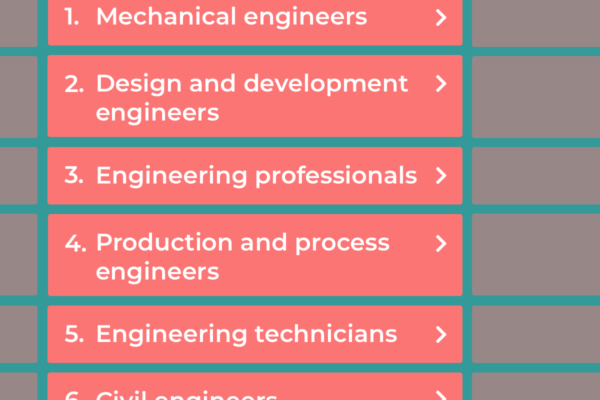
Career transparency
Our new approach to this component is a simple ordered list. With paging options at the bottom to move to the next page. Working in this way, we are immediately showing users 5 possible careers people go on to do. Where clicking on a career loads up the data in the right hand panel.
Taking this approach achieves a number of objectives:
- Immediately the user sees 5 career options. Which is more engaging than a single option
- Seeing a range of careers works better in instances where a user doesn’t like the look of the first career in the list
- Because we’re now showing a list, it’s clear that there are even more careers to see using the paging links. Encouraging interaction.
- It now becomes easier for users to navigate through the list of careers, looking only at those of interest
We hope you like and appreciate the update and as always will value your feedback.